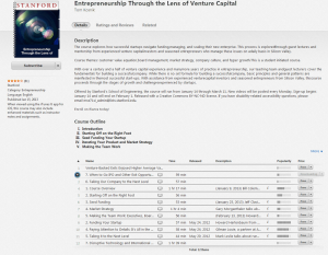
This shows the iTunes entry for the course with description, course outline and list of videos.
In looking at Open Course materials, I chose to look at iTunes U since I had not used it before. I went to Standford University and chose a business class since I am a Business Education teacher. The course I chose is Entrepreneurship through the Lens of Venture Capital (see picture for more detailed information).
At first, I downloaded the course on my laptop and discovered that only the lectures and one PDF were available to me. There was a note that there would be some extra materials if you downloaded the app on your iPhone or iPad. So my first question was, “What if the person did not have an iPhone or iPad?” Luckily, I have an iPad and was able to download from there.
ADDIE
In terms of order and topic, there does seem to be a logical progression to the courses. So, let’s look at this based on the ADDIE model of design (“ADDIE Model,” 2014):
Analysis
We have to make an assumption, since it is a university course, Stanford professors looked at their audience, objectives, delivery options, pedagogical issues, and theories to be utilized. There is an assumption by the professors that all students will learn sufficiently through video and readings. There was not really any interactive part where students could ask questions and get answers other than one discussion post assignment. There did not seem to be any “values and services offered to students through their exposure to others” (Simonson, Smaldino, Albright, & Zvacek, 2012, p. 155).
Design and Development
While what is shown is a good beginning, there are some missing pieces in this phase. The user interface is different from computer to app. The version downloaded to my computer simply had the lecture videos and one PDF file. While the app has more information, attachments (discussion board link, readings and videos), and functions, it still does not have all the different aspects to create a full course for students.

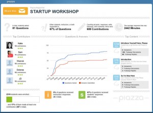
This shows the statistics from Piazza for the course.
As to the discussion board, there was a comment for students who were at Stanford paying for courses that their board was accessed differently. In logging in and viewing the discussion board for the Open Course, which was on Piazza, it did not seem as if it was moderated well. People were going into any week and posting their introductions. Some students were confused about the discussion board, but I did not see any comments from teachers to point them in the right direction. There were a lot of “unresolved follow ups” for the postings. Out of hundreds of posts, I found about five that were related to the lectures. If a student posted a question about the lecture, it was answered by another student (if it was answered at all). As you can see from the image, zero percent of the questions were answered by instructors.
Implementation
“It is important to remember that no matter which technological formats are used in distance education, the trend is to reduce the ‘amount’ of information delivered and to increase the ‘interactive value’ of the learning experience” (Simonson, Smaldino, Albright, & Zvacek, 2012, p. 157). The implementation of this course does not seem conducive to true learning of the material. If a student does not do well with videos and reading on their own, there did not seem to truly be a way for them to reach out to the instructors for clarification or more in-depth information. There was also a difference in how it was implemented across platforms, computer iTunes access versus iTunes app for iPhone and iPad.
In the app, there were links to a discussion board, readings, and extra videos to watch that were relevant to each lecture. The app even has two places to look for information – “Posts” and “Assignments.” The other bit of information I found lacking on my laptop was the video descriptions. When I looked in the app, there was a description and brief biographies on the lecturers.
When looking at the description in the iTunes store, there is a course outline (I-V) and the videos are numbered (1-7 with some duplicates). You are not sure which videos go with the different topics on the course outline. When looking in the app, the information is separated by the weeks the course originally ran, but again, there is no reference to the different parts of the course outline. The videos were created in a face-to-face classroom, and they have a slight echo to the sound at times.
Evaluation
There was no way for students to be evaluated or for them to leave relevant evaluation information and give feedback. In iTunes, you could rate the individual videos or the course with one to five stars or write a review for the course. There was no way to know if anyone had looked at the ratings, and the one review just said “Good.”
_____________________________________________________________________________________
Dr. Michael Simonson stated, “Distance education is not identical to face-to-face education, but it is equivalent” (Laureate Education, n.d.). In viewing the videos, there was more interaction available in the face-to-face classroom than online. Since paying students had a different discussion board, there was no way to tell if there was more interaction with the professors and students. This does not seem to be equal education. While the materials are available 24 hours a day and students can work through the information at their own pace at this point, the students do not have access to the professors or experts as the face-to-face students did. They do not enjoy the give-and-take of discussions, not even online.
Simonson, et al, state that distance learning faculty should:
- Retool traditional courses for online learning,
- Illustrate key ideas, concepts, and topics,
- Create activities for interactivity,
- Allow for student group work, and
- Be prepared for technical difficulties (Simonson, Smaldino, Albright, & Zvacek, 2012, p. 153).
This particular course feels more like they simply put the information online and expected potential students to know what to do. There is a lot of reading, but no clear way to know what the instructors expected the student to get out of it. While a discussion board was created, without a moderator, it did not function as well as it could have. There were no interactive quizzes where students could see if they understood the information. If there were any technical difficulties, it was up to the student to figure out how to fix it.
In this open course evaluation, there is still a lot of work to be done to make this more interactive and less of putting the face-to-face classroom lectures out on iTunes. The readings do add to the lectures to a certain extent, but there is no way to understand how the information fits together and gain a deeper understanding of the content. The biggest problem lies in the discussion board that was set up on Piazza. There is no moderator, students are left to their own devices, and there is a lot of confusion about how it works.
As a business education teacher, I can see the value in this information, but for it to truly be a model online course, there is much work still to be done.
Resources
ADDIE model. (2014, July 24). Retrieved August 1, 2014, from Wikipedia website: http://en.wikipedia.org/wiki/ADDIE_Model
Laureate Education. (n.d.). Theory and distance learning [Video file]. Retrieved from https://class.waldenu.edu
Simonson, M., Smaldino, S., Albright, M., & Zvacek, S. (2012). Teaching and learning at a distance: Foundations of distance education (Fifth ed.). New York, NY: Pearson.
